When someone lands on your multilingual site, you want them to have a consistent user experience which includes the ease at which they find your language switcher, no matter which language version of your site they land on. This means French speaking visitors who visit your English site should see the same branding and design as the François version.
To achieve this, we have introduced two variations for different scenarios:
1. When the entire website is fully bilingual
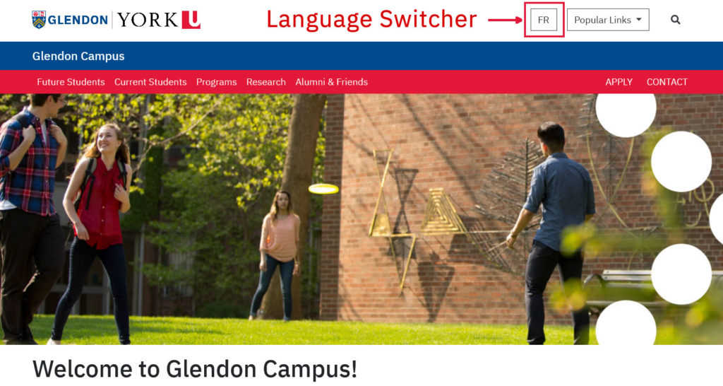
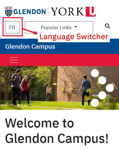
In a case where all the pages on your website are fully translated, the language switcher is placed in the most prominent location which is the header. This ensures consistency in the switcher location on every page on the website.
Below is a visual example using the Glendon Campus website.
Desktop View

Mobile View

2. When few pages are bilingual
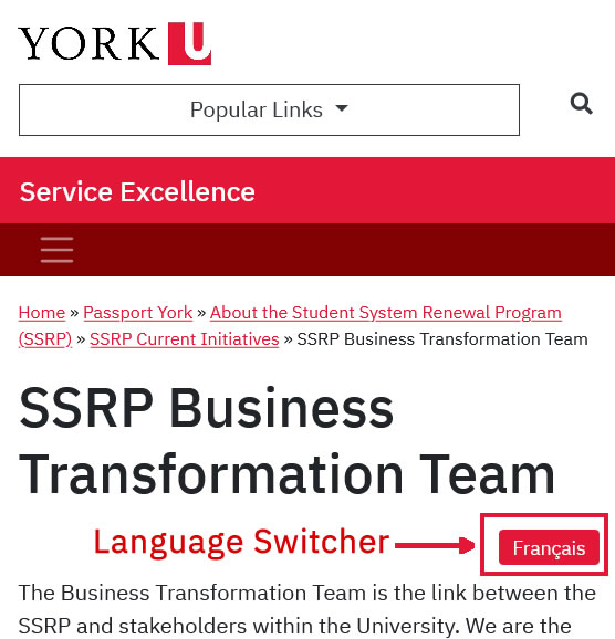
In cases where one or two pages on your website are bilingual, the language switcher is to be placed at the top of the content body. This ensures that the switcher options is visible above the fold for visitors to interact with thus improving the overall user experience of visitors.
Below is a visual example of a page within the Service Excellence website.
Desktop View

Mobile View

Please note:
- The first variation is to be used when your website if fully translated
- The second option is to be used when few pages within your website are translated
