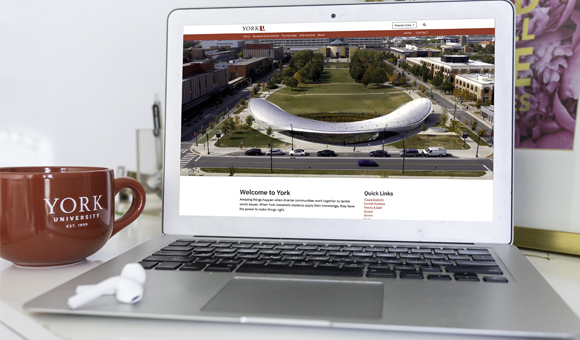
The York community is invited to visit the University’s new website which launched on Aug. 31 with a modern design, enhanced functionality and an improved user experience.
As part of the new pan-University web optimization strategy, the website underwent a major refresh to significantly improve the experience for visitors and infuse elements of York’s new visual system and brand. The new Faculty of Education web site was one of the pilot sites for the launch.

The website gives users a mobile-first, content-driven and social media-enabled experience. The yorku.ca main page projects a warm and welcoming feeling while also capturing York’s progressiveness through a dynamic video showcasing the strengths of York’s programs and community. A key element of giving users a more streamlined experience is the new universal navigation throughout the site, designed with key audience objectives in mind. With a few clicks, audiences can access relevant information and resources on an easy-to-navigate website. The Faculty of Education's website was
Since the last major update to York’s website in 2014, the way users look for information has evolved dramatically. A critical part of the process has been extensive backend work to help ensure York’s website is higher in search engine results, and that York’s site and its pages are easier to find for external visitors and the University community. The new website allows the University to meet the Jan. 1, 2021 deadline for enhanced accessibility requirements, mandated by the Accessibility for Ontarians with Disabilities Act (AODA), for websites and web content published after 2012.
“The first phase launch of York’s refreshed website marks the culmination of a comprehensive effort to give visitors a more rewarding and enriching online experience,” says York University’s Chief Communications and Marketing Officer Susan Webb.
“The site you see today reflects York’s shared sense of purpose and identity by capturing who we are, what we stand for, and what we offer. We believe the refreshed website will become a point of pride for many of us in the York community and beyond,” says Webb.
The website updates were informed by extensive research conducted with 16 key audiences, and broad consultation with University communication managers and website owners. A Digital Experience Council (DEC) was created as part of the governance structure to bring together representation from across the University to help ensure the successful planning and implementation of the project, and to guide ongoing improvements and updates. Industry best practices were also applied to the project.
Led by York’s Director, University Brand & Marketing, Robin Edmison, in close co-operation with University Information Technology (UIT), the project was truly a collaborative, multi-stakeholder effort. “We are grateful for the commitment and valuable input of our dedicated stakeholders and key audiences,” says Edmison.
Due to the size and complexity of York’s website, full implementation will occur in phases. Today marks the completion of phase one, which includes launching more than 15 full and partial websites such as the main page, and several Faculty and Divisional sites.
The second phase of implementation, which is planned from September to January 2021, will include additional Faculty and divisional optimized websites. View a previous YFile article for more specific details.
Key features now on York’s new website include:
- Improved design – A modular design allows flexibility to customize content and visuals while creating a more consistent look across York’s web pages.
- Easier to find information – A new “Popular Links” tab will replace the current “Quick Links” in the top navigation ensuring visitors find the most relevant content faster.
- Improved navigation – The menu on each webpage remains visible and in the same position as the user scrolls down and moves around the site.
- More social media enablement – Access to social media feeds is improved.
- Easier for future students to apply – A permanent “Apply” button is placed on all webpages.
- Improved functionality – Information is organized by content type, such as Faculties and programs.
- Easier to find contact information – An area-specific “Contact Us” page centralizes all the University’s contact information for various Faculties, schools, divisions and services.
- More streamlined design – New digital logo and a universal footer creates a consistent feel.
- Better data – Analytics and reporting for web and social media are now standardized across the University using Google Analytics and Google Data Studio.
As improvements to the website continue, input from the community is welcome and can be shared through a new feedback button on the website or by emailing cpadigit@yorku.ca.
For key FAQs on how to navigate the new site, and details on the overall web optimization project, visit yorku.ca/digital-experience-hub.
