Wordmark Story
Welcome! We are excited to unveil our new wordmark!
It is a reflection of the Indigenous communities to which our members belong. It symbolizes our commitment to honouring and recognizing their contributions and values. The design was created by an Indigenous student studying in the School of the Arts, Media, Performance and Design right here at York University.


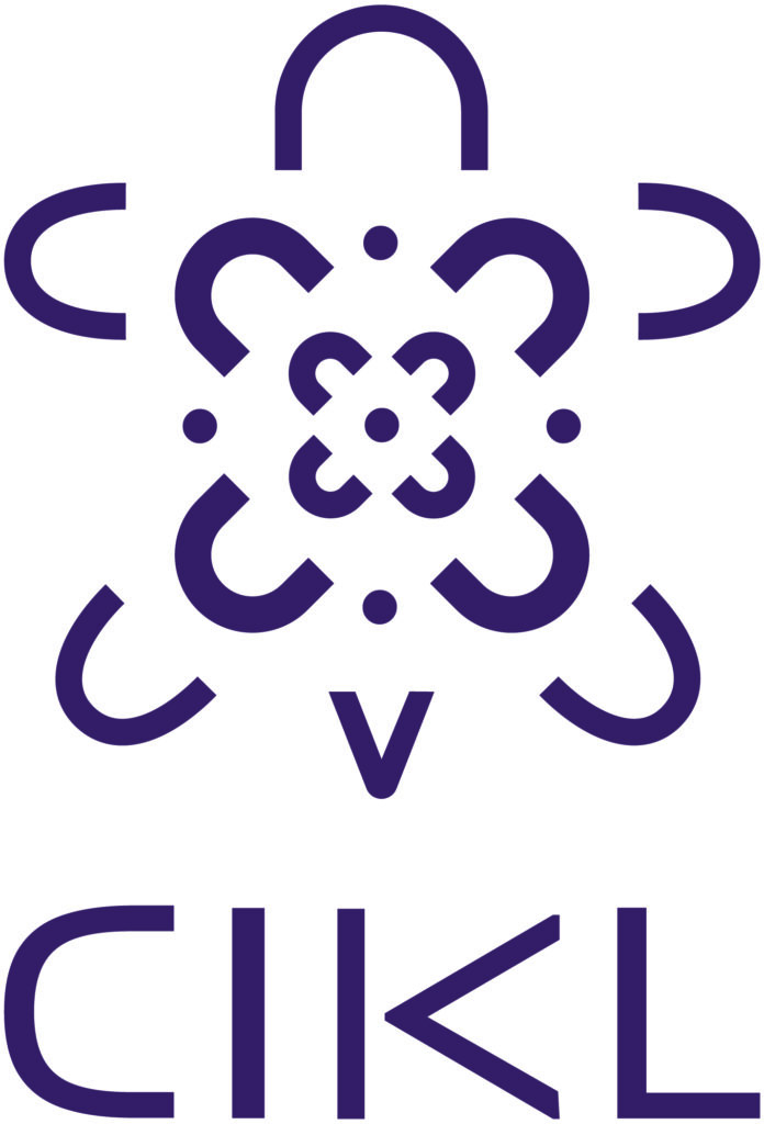
Design: The centrepiece of our wordmark is the turtle, it represents Turtle Island, a term used by Indigenous communities to refer to North America. The turtle symbolizes identity, culture, and earth connection. It reminds us to take care of the land we inhabit and the communities we serve.
Colour: The beautiful purple colour in our wordmark is inspired by the Haudenosaunee flag. Purple is one of the main colours in their flag, representing mutual respect, peace, and harmony among nations.
Font: Both the turtle and the font of “CIKL” beneath the turtle celebrate the many communities who presently use or formerly used syllabics. This writing system has been used by many groups including the Algonquin, Inuit, and Athabaskan language families.
Our new wordmark serves as a visual representation of our company's values and our dedication to building a more inclusive and diverse business environment. It is a reminder of our ongoing commitment to supporting Indigenous communities and creating opportunities for mutual growth and prosperity.
Here is our Wordmark!

