Interactive Syllabus
By Shirley Roburn

As the school year starts, “it’s in the syllabus, read the syllabus!” memes inevitably pop up in my social media timelines. Especially with large lecture courses, it is almost inevitable for course directors to be peppered with dozens of questions about assignments, lectures, and quizzes, even though answers to these questions are almost always clearly laid out in the syllabus, with course details also being carefully gone over in class.
During the pandemic, I found it especially challenging to ensure that students were taking the time at the beginning of the year to go over all the key course information for my early-year large lecture course. In an attempt to address this, I created an interactive H5P version of the course syllabus for the COMN 2700 eClass site.
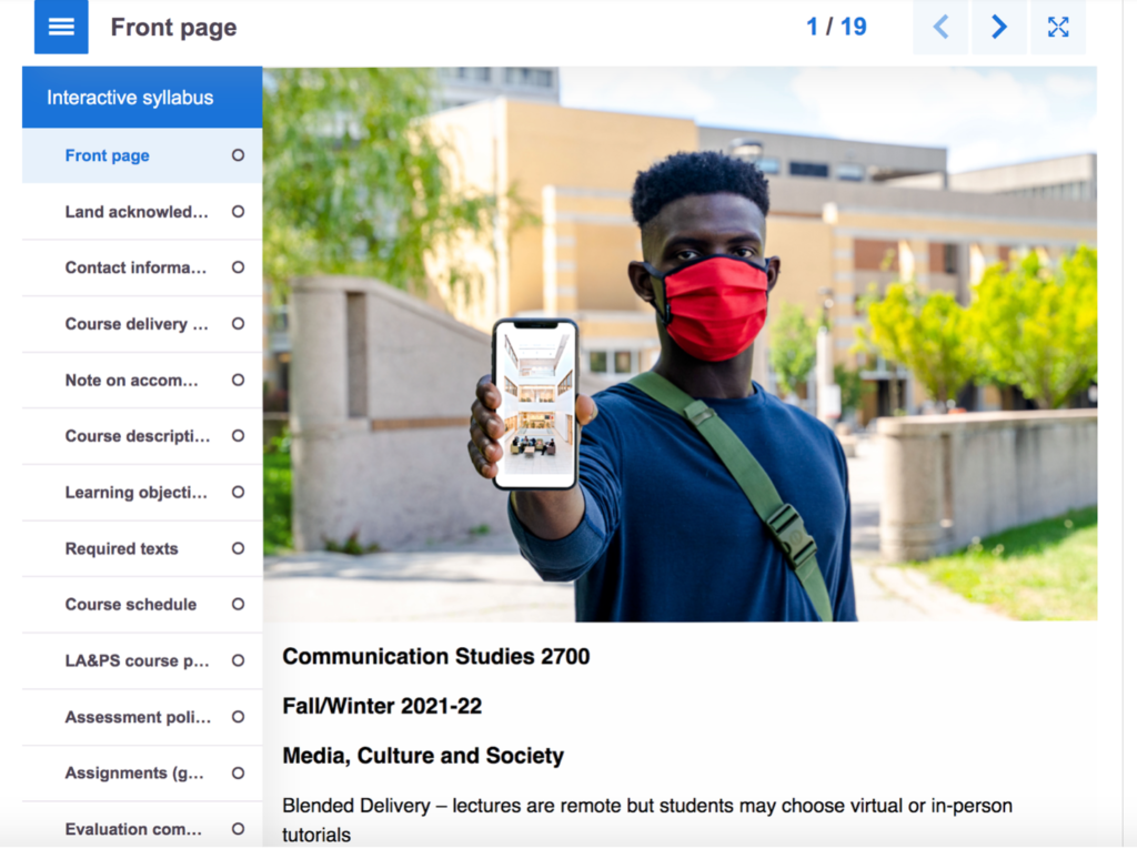
I used the H5P ‘book’ function to make the syllabus. I broke the syllabus down into sections marked by tabs with simple titles. Links to the key sections could be seen at a glance, and each topic was separated into an easily digestible section, or into multiple sections for larger topics such as assignments. Within the ‘book,’it is possible to insert a range of other H5P tools such as pictures, videos, and even games or exercises in the individual tabs. While I kept it fairly simple, being able to add photos and use some of the fancier bulleting features helped to create some visual interest and to highlight crucial points. Also, because students had to click through the sections of the syllabus, at least some action and level of attention was required on their part to navigate, which hopefully translated into greater focus on the material students were navigating through. To further encourage students to read the syllabus, I included syllabus-based questions in the course introductory scavenger hunt assignment. The overall goals of this assignment were
- to encourage students to explore the eClass site and get familiar with where key information like assignment rubrics were posted,
- to ensure that students completed the Academic Integrity pledge,
- to make sure students signed in properly to extensions like Perusall, which were used in the course.
As it was a simple way to get participation grades, most students completed the scavenger hunt. While I and the course TAs still got a number of questions in the first weeks of class where the answers were in the syllabus, I believe having an interactive syllabus, along with a learning activity where students had to navigate it, increased student engagement with the syllabus.
I also had a pdf version of the syllabus posted to the course site. One of the things I found challenging was that I had to make sure to update any changes in both syllabus versions so that there were no inconsistencies. The syllabus pdf, which I created from a word document, was much more efficient to update. I don’t have an easy fix for this issue – for accessibility reasons, it’s important to keep the pdf version. However, once the setup is done, an interactive syllabus template is easy to import and adjust from year to year. I think the added functionality of having an interactive syllabus, and the resulting increase in students figuring things out for themselves by reading the syllabus, is likely worth the extra initial effort required for setup.
Images

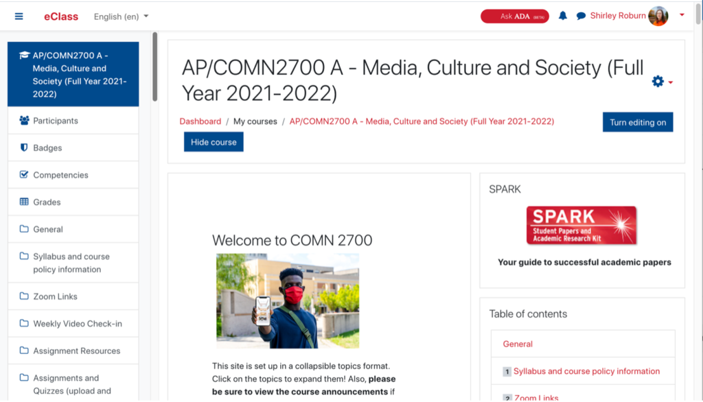
Fig.1: Front page of the course eClass site. The syllabus link is visible in the left hand column.

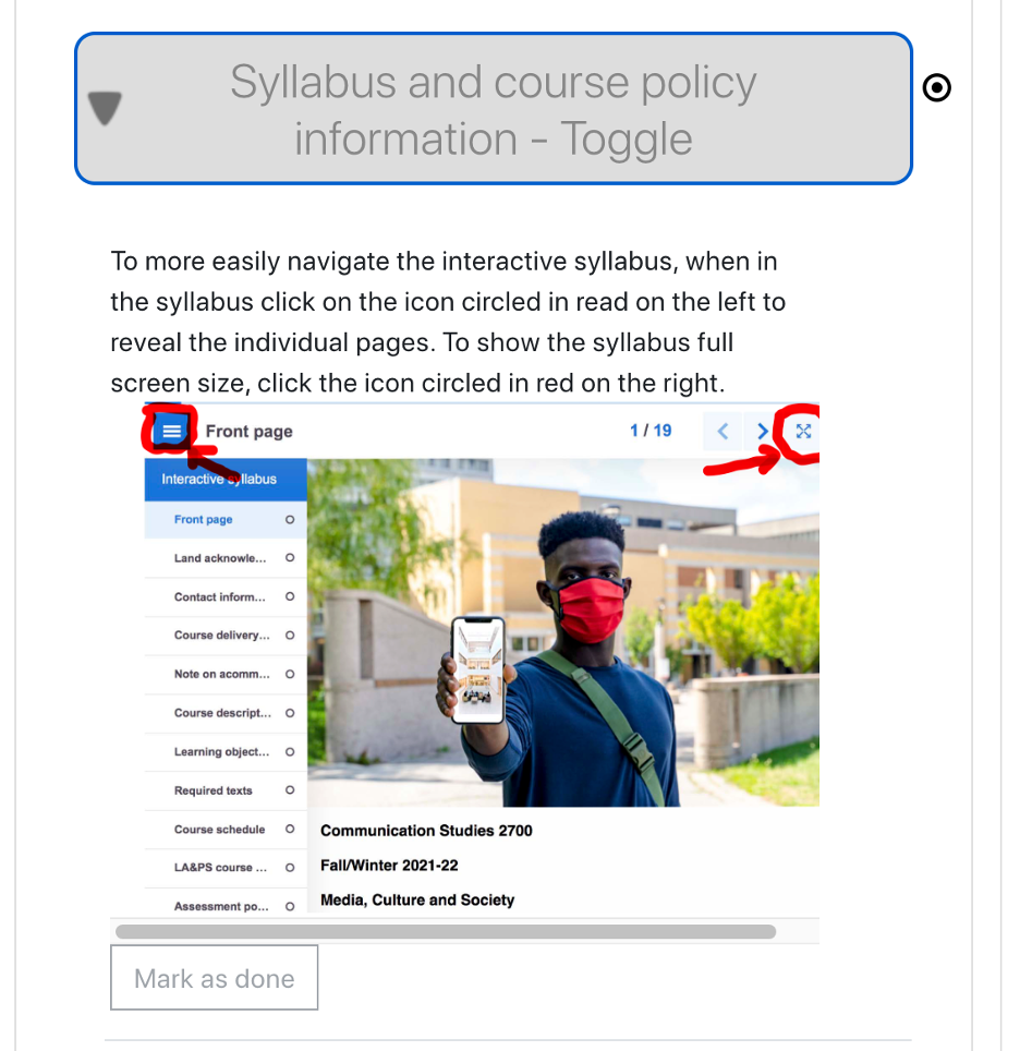
Fig. 2: Explanation for students of how to navigate the interactive syllabus.

Fig. 3: Front page of the interactive syllabus. Topics are broken down on the left – the syllabus was broken down into 19 tabs! For large topic areas such as assignments, I used multiple tabs to keep the information on any given page to a manageable amount.
